The look, the feel, the aroma, the environment…. How does a unique coffee shop make you feel? Busy mornings or laid-back afternoons offer quite different experiences to the caffeine addict. Whether brewing to morning commuters, sleep-deprived students, or busy businessmen, coffee shops seem to attract a wide array of customers. Though on the practical side most of us can physically make a cup o’ joe at home, it is the experience of ordering, sipping and sharing a cup of coffee that makes buying a cup more desirable than the actual taste of coffee.
User Experience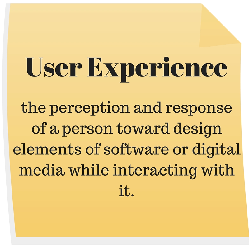
It may come as a surprise, but user experience is a relatively old term. The term “user experience” can be applied to any experience involving any interaction or personal encounter. But user experience as it relates to experience with digital technology has been used at least since 1995. When Don Norman was given the job title “User Experience Architect”, his job description at Apple consisted of conducting research to improve the design of upcoming products. Later on, in 2007 when Apple revealed its first iPhone, “user experience” was all the buzz and became the focus of future cellphone designs.
But why is user experience important for business owners and their websites? Jesse James Garett put it best when he said, “Businesses have now come to recognize that providing a quality user experience is an essential, sustainable competitive advantage. It is user experience that forms the customer’s impression of the company’s offerings, it is user experience that differentiates the company from its competitors, and it is user experience that determines whether your customer will ever come back.”
The 7 key concepts of user experience, as developed by Peter Morville can be applied to websites. The following characteristics will help website designers focus their efforts to develop websites that deliver an unparalleled user experience.
1) Useful
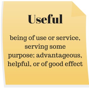 What is the purpose of a particular website? Is it meant to be informative and educational, or amusing and lighthearted? It is important to understand the audience and address the reason for their visit. There is probably nothing more frustrating then when a SERP shows a meta description containing the relevant keywords, but the web page is completely off-topic. Neither the meta description nor the website proved to be useful or helpful to the visitor. This negatively impacts a site’s bounce rate and doesn’t attract the right audience. Simply put, this website is not useful to its visitors and is not accessible to those searching for the content that the site actually provides.
2) Desirable
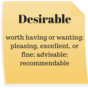 Taking some pointers from the dating game, let’s bring up the laws of attraction. The looks, the feel, the mood, the sensation, the environment.. What do they all say? Whether it’s love at first site (pun intended) or after a few interactions, the first impression is key to encouraging future dates, er, return visits. Creating a desirable or attractive website is the first step towards encouraging a phone call or a completed form.
Another question website builders should ask is if the website would be something visitors would like to share with others. Take, for example, social media sites Pinterest and Tumblr. The ability to share images and curate mood boards in a layout that encourages sharing is not only desirable to the users but to the platform builders as well! A recommendable site is a desirable site.
3) Accessible
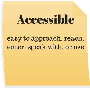 When we’re out and about socializing and networking, we’re looking for people who are approachable, easy to talk to, and within our reach of influence. Why should websites be any different? Websites that require email addresses, or contact info to gain access to entry don’t encourage new visitors. Imagine if someone you just met asked for your personal information before deciding if they wanted to talk to you? Off-putting, maybe? We definitely think so!
Maybe the website designers are assuming that the visitor’s preconceived perception of the website’s value will be sufficient to encourage submitting contact info to gain website access. But the reality is that this hindrance to website accessibility may increase bounce rate. And in turn, the website does not receive the highest possible volume of visitors. On the other hand, maybe an ecommerce website values the aspect of usefulness over the aspect of accessibility. In this case, it would be more useful for the website to receive a lower volume of relevant traffic, rather than a high volume of irrelevant visitors.
Another way to increase a site’s accessibility is to improve mobile responsiveness. Google has included mobile responsiveness as a ranking factor for SEO. And to further emphasize the importance of having a site compatible with mobile, a survey conducted by Keynote found that 46% of mobile users report having difficulty interacting with a web page, and 44% complain that navigation was difficult. In online shopping, 67% of shoppers were more likely to buy from a website compatible with mobile devices.
4) Credible
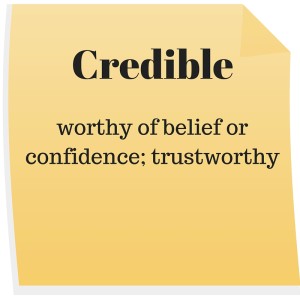 Remember when you were growing up and you had that one cousin who was just supremely gullible and believed every word you said even when you were failing at suppressing your laughter? Well, most internet surfers are over the age of 10 and have a keener and more critical eye for information that is credible and trustworthy. According to a Keynote 2012 Mobile User Survey, 94% of people cited web design as the reason they mistrusted or rejected a website. As it turns out, simply having a modernly-designed website creates a first impression of credibility.
Websites that have blogs with well-written and researched content serve a purpose beyond raising SEO rankings. They also develop credibility. Methods of building credibility include case studies, portfolios, and customer testimonials.
5) Findable
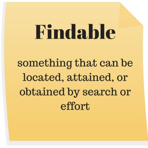 Forrester Research has estimated that $1.1 trillion of all retail sales in 2011 were “web-influenced”. We can therefore assume that “web-influenced” refers to a website that is findable.
There’s nothing more frustrating about a website then when you can’t find a piece of critical information that you know every website should have. Like when the contact information is a tiny link at the way bottom of the page, instead of a tab at the top of the page where it should rightfully belong.
The other major problem some websites can encounter, a problem expected for new websites, is simply not showing up competitively in SERPs (search engine results pages). To improve “findability”, it is important to optimize for keywords, create accurate meta descriptions, and publish content on blogs relevant to the website’s subject.
6) Usable
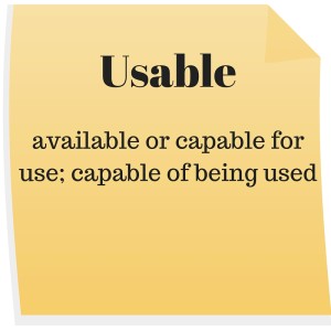 Well here’s an obvious one! After purchasing a product we expect it to perform its functions as advertised. Well, if a website exists then we as mere website visitors expect the website to function. Beyond functionality and usability visitors are looking for simplicity of use. Regardless of how complex your website may actually be it needs to appear simple and effortless.
When a website has slow load time or pages don’t display properly the user experiences something called web rage. (It’s a real thing, check it out.) From cursing at phones, to screaming and throwing phones, and behaving even less normally, studies have been conducted and the numbers are in. According to Econsultancy, 40% of people will abandon a web page if it takes more than three seconds to load.
Going back to the user experience, no website owner would want those feelings of rage associated with their brand or business. And so it would be in everyone’s best interests to look into improving a website’s performance.
7) Valuable
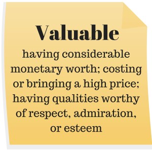 Last, but certainly not least, is the importance of addressing the value provided by the website. From personal experience, we can say that a website that has consistently proven its value in content is a website worth visiting. Over and over and over.
There are various methods of increasing the value of a website. Consistently updating and revising your website to optimize user experience will bring value not only to your web traffic but to you as a website owner as well. When we visit news websites, for example, we expect the content to be the latest and presented in a user-friendly manner. The same should be for all websites.
As the retail principle declares, 80% of sales come from the 20% of loyal customers. Providing value to website visitors will not only encourage return visits but will also warrant recommendations to other potential visitors. This is especially true for e-commerce sites.
And The Most Important Factor Is….
In an example briefly mentioned earlier, we mentioned that an e-commerce site may pursue usefulness as a key characteristic rather than accessibility. If a high-end online retailer were to receive high-volume traffic from low-income consumers the visits wouldn’t be useful to the retailer, nor to the consumer.
Likewise, websites that seek to educate would strive to improve “find-ability” and usefulness but may not necessarily focus on desirability in respects to the website layout or design. Take, for example, Wikipedia. The site is very findable, accessible, and [arguably] useful. Yet it is not one that is desirable judging by its layout or design, or one that encourages sharing. Yet as an online encyclopedia it clearly serves its purpose.
Offering testimonials on an e-commerce site is gold when it comes to building credibility. The methods of raising credibility of celebrity gossip sites, on the other hand, are scarce, if not non-existent. While the celebrity gossip site is definitely desirable, shareable, and accessible, the e-commerce site focuses on building credibility and desirability.
To sum up our answer to this rather unanswerable question, the answer is there is no answer. The key takeaway is to find the right combination of factors to best serve your audience. Whether it be an accessible and desirable fashion blog or a credible and valuable industry news source, finding the balance to provide the best possible user experience requires regular, testing, optimizing, and updating. Just as audiences change, grow, and evolve, so must websites.
[otw_shortcode_button href=”https://www.integritymediacorp.com/get-in-touch/” size=”medium” icon_position=”right” shape=”square” color_class=”otw-red”]Improve your Website’s UX[/otw_shortcode_button]


